A simpler approach to a nutritional diet.
Having a hard time trying to make sense of what you should or shouldn't be eating nowadays? With all the different diet facts, opinions, and scientific breakthroughs, many of us are becoming more and more unsure about how to choose the right foods, and in the right amounts to have a healthy diet.

Luckily for those that don't already know, a new Food Guide with updated quantities and types of foods that we should be consuming in todays modern world has been released
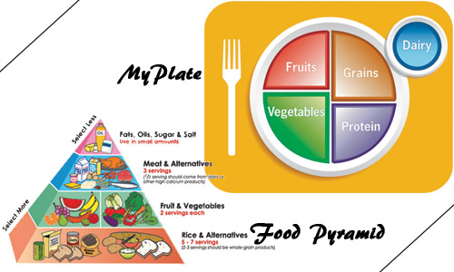
The USDA food pyramid that we are all accustomed too was created in 1992 and divided into six horizontal sections containing depictions of foods from each section's food group. Nearly two decades later, a new food guide has been created and would you believe they've scrapped the pyramid altogether.
The new Food guide has been dubbed the MyPlate and features a more pie-chart style graph for foods we should be eating. It has a more simplified look that everyone would be guaranteed to understand, but not everyone may agree with. The reason I say this is because sweets and fats have been sidelined altogether!
The Myplate is divided into sections of approximately 30% grains, 40% vegetables, 10 % fruits, 20% protein, and it is all accompanied by a smaller circle that represents dairy intake, such as a glass of milk or a yogurt cup.
In the unveiling of the MyPlate even First Lady of the United States Michelle Obama had some notable words to say - "Parents don't have the time to measure out exactly three ounces of chicken or to look up how much rice or broccoli is in a serving. ... But we do have time to take a look at our kids' plates. ... And as long as they're eating proper portions, as long as half of their meal is fruits and vegetables alongside their lean proteins, whole grains and low-fat dairy, then we're good. It's as simple as that."
#y101fm #alwaysfirst #food

